Reviewed: “Finding Brutalism” and “SOS Brutalism”

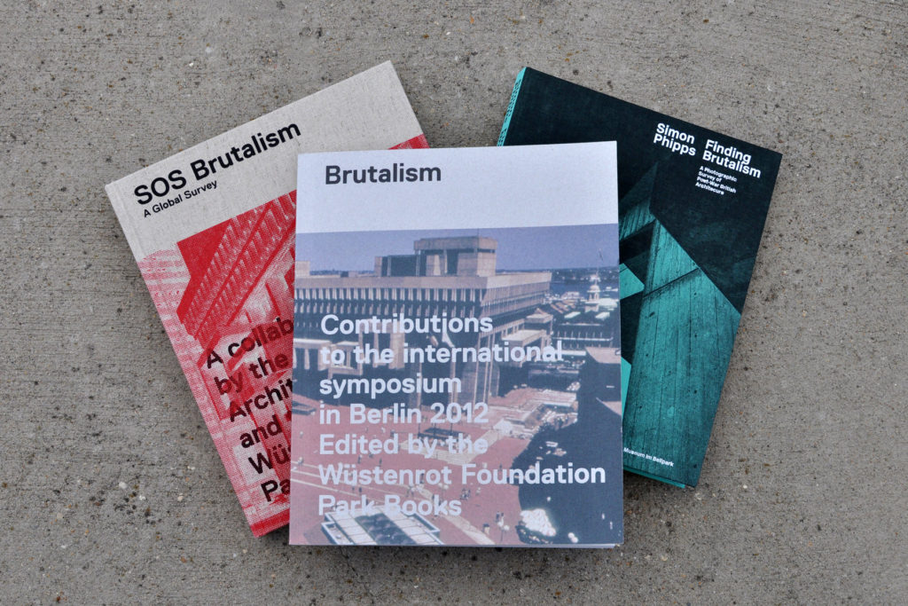
“SOS Brutalism” (two volumes) and “Finding Brutalism”

Here at BrutalistDC headquarters, we have several shelves dedicated to all matters concrete, and have had to make room for the many new editions that have been arriving at a steady pace for the last few years. Two of the latest, “Finding Brutalism” and “SOS Brutalism,” (both from University of Chicago Press and Park Books) offer new looks at the style. BrutalistDC founder Deane Madsen reviewed them for Architectural Record:
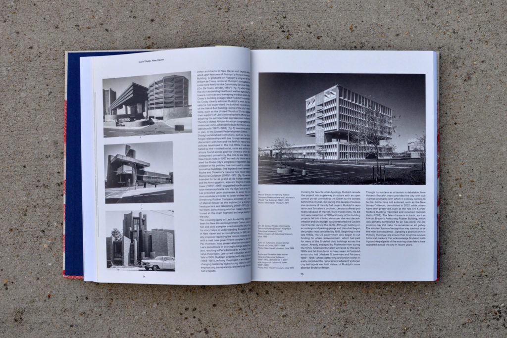
An interior spread from SOS Brutalism features Marcel Breuer’s Pirelli Building

SOS Brutalism presents the theoretical issues behind the term in a two-volume set covering the origins, current state, and potential future of Brutalism. The eponymous first volume is a worldwide compendium—based on the website #SOSBrutalism—that has more than 1,100 Brutalist buildings in its database.

This effort is filled with case studies and examples of structures of varying status: still in use (such as Minoru Yamasaki’s Shiraz University in Iran), heritage-protected, under threat of elimination, or demolished. Chapter introductions show the divergent attitudes to each region’s embrace of the movement. The companion volume, Brutalism: Contributions to the International Symposium in Berlin 2012, comprises 17 lectures in which authors investigate theories and regions where Brutalism was practiced according to country-specific interpretations.
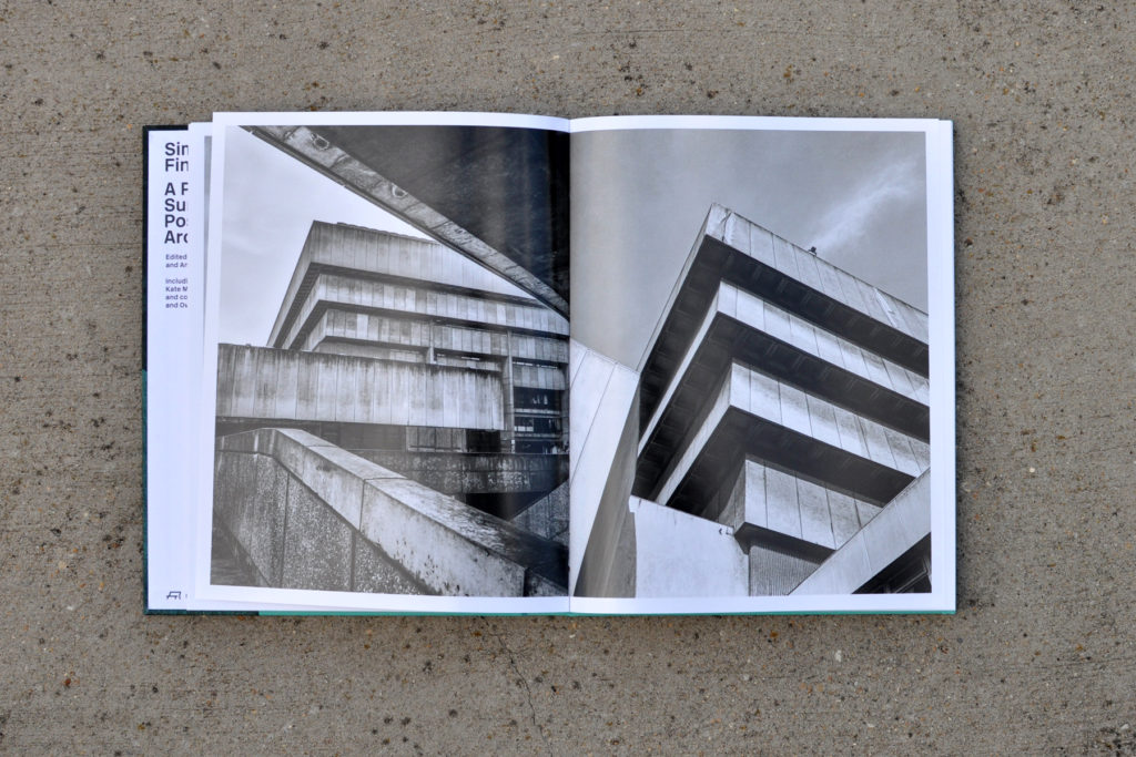
“Finding Brutalism” features the stunning black-and-white photography of Simon Phipps

In Finding Brutalism, Simon Phipps lets a rich assortment of his black-and-white photographs do the talking, save for a trio of essays at the back. But that’s precisely the point: each of his images is a 1,000-word composition on material, scale, or form, and Phipps is a master storyteller in this medium without “the distractions and extraneous detail of color,” so, as he writes, “the form and structure and surface textures [can] be amplified by the action of light and shadow.” His approach returns to the origins: “The biggest misunderstanding about Brutalism is that it is all about concrete—not only concrete, but massively formed concrete. The essence of Brutalism for me is material ‘as found.’ ”

Read the full story at Architectural Record.

BrutalistDC Featured in On Tap Magazine’s District of Design Edition

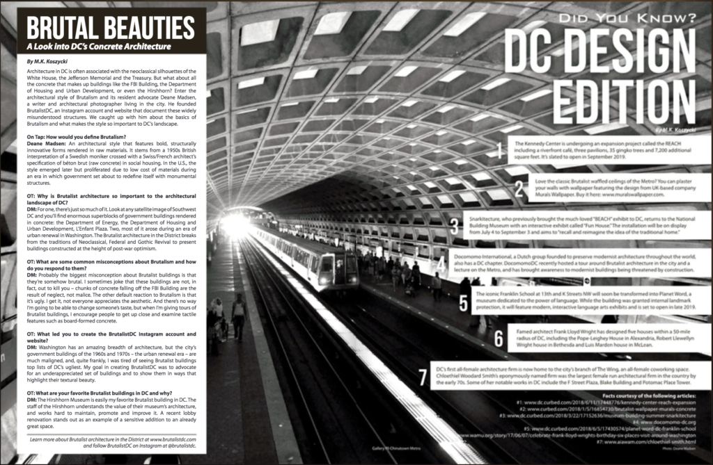
On Tap Magazine recently released its July edition, which focused on design in Washington. BrutalistDC founder Deane Madsen was thrilled to be interviewed by M.K. Koszycki for the issue, an excerpt of which is below:

On Tap: Why is Brutalist architecture so important to the architectural landscape of DC?
Deane Madsen: For one, there’s just so much of it. Look at any satellite image of Southwest DC and you’ll find enormous superblocks of government buildings rendered in concrete: the Department of Energy, the Department of Housing and Urban Development, L’Enfant Plaza. Two, most of it arose during an era of urban renewal in Washington. The Brutalist architecture in the District breaks from the traditions of Neoclassical, Federal and Gothic Revival to present buildings constructed at the height of post-war optimism.

OT: What are some common misconceptions about Brutalism and how do you respond to them?
DM: Probably the biggest misconception about Brutalist buildings is that they’re somehow brutal. I sometimes joke that these buildings are not, in fact, out to kill you—chunks of concrete falling off the FBI Building are the result of neglect, not malice. The other default reaction to Brutalism is that it’s ugly. I get it, not everyone appreciates the aesthetic. And there’s no way I’m going to be able to change someone’s taste, but when I’m giving tours of Brutalist buildings, I encourage people to get up close and examine tactile features such as board-formed concrete. On the pairs of columns at the base of HUD, for example, you can actually feel the grain of the wood that was used to form the columns embedded in the concrete. The attention to detail paid to the concrete formwork resounds throughout the rest of the architecture as well, and if I can help people appreciate the architectural effort behind these buildings, perhaps they can also grow to like them.

OT: What led you to create the BrutalistDC Instagram account and website?
DM: Washington has an amazing breadth of architecture, but the city’s government buildings of the 1960s and 1970s—the urban renewal era—are much maligned, and, quite frankly, I was tired of seeing Brutalist buildings top lists of DC’s ugliest. My goal in creating BrutalistDC was to advocate for an underappreciated set of buildings and to show them in ways that highlight their textural beauty.

OT: What are your favorite Brutalist buildings in DC and why?
DM: The Hirshhorn Museum is easily my favorite Brutalist building in D.C., for many reasons, but the foremost is that the staff of the Hirshhorn understands the value of their museum’s architecture, and works hard to maintain, promote, and improve it; a recent lobby renovation stands out as an example of a sensitive addition to an already great space. The Hirshhorn benefits from its prime location at the midpoint of the National Mall, and its diminutive scale relative to the nearby Air & Space Museum and
National Gallery of Art makes for a pleasant respite. The Hirshhorn Sculpture Garden is also perhaps one of D.C.’s best-kept secrets, with shaded greens populated with works by the likes of Auguste Rodin, Barbara Pepper, and Henry Moore, along with more recent acquisitions such as Yayoi Kusama’s Pumpkin.

Beyond the Hirshhorn, there are plenty of other buildings to love, but I’m especially keen on the architecture of D.C. Metro, which was designed by Harry Weese and opened in 1976. The deeply coffered, column-free vaults evoke the monumental scale of Washington (each station is 600 feet long) while also serving up dramatic—and photogenic—shadows, thanks to lighting designer William Lam.

Read the full article at On Tap Magazine