BrutalistDC Featured in On Tap Magazine’s District of Design Edition

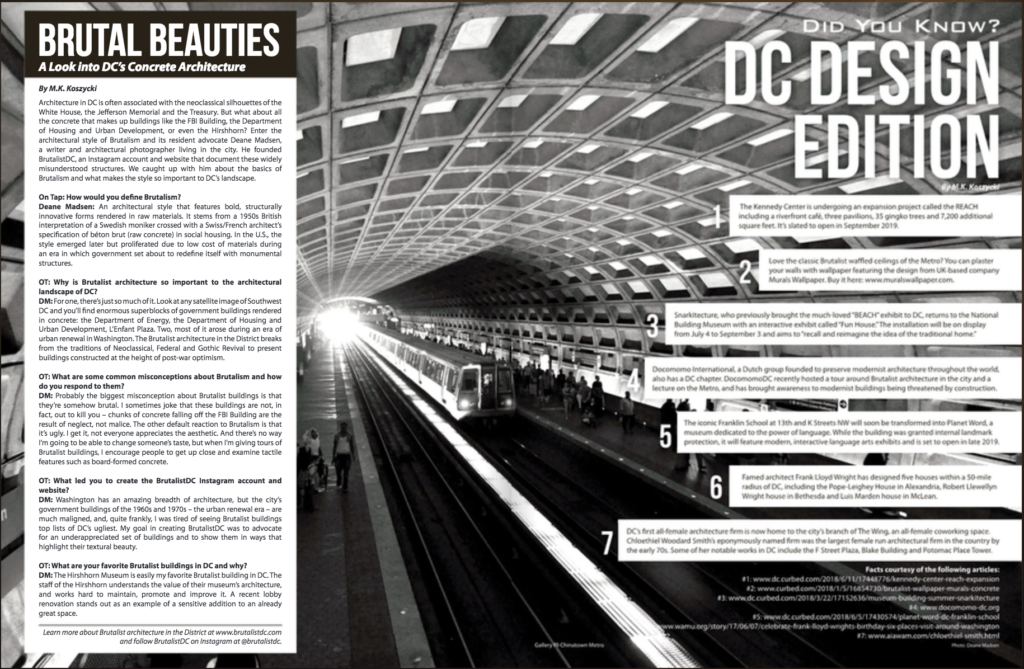
On Tap Magazine recently released its July edition, which focused on design in Washington. BrutalistDC founder Deane Madsen was thrilled to be interviewed by M.K. Koszycki for the issue, an excerpt of which is below:

On Tap: Why is Brutalist architecture so important to the architectural landscape of DC?
Deane Madsen: For one, there’s just so much of it. Look at any satellite image of Southwest DC and you’ll find enormous superblocks of government buildings rendered in concrete: the Department of Energy, the Department of Housing and Urban Development, L’Enfant Plaza. Two, most of it arose during an era of urban renewal in Washington. The Brutalist architecture in the District breaks from the traditions of Neoclassical, Federal and Gothic Revival to present buildings constructed at the height of post-war optimism.

OT: What are some common misconceptions about Brutalism and how do you respond to them?
DM: Probably the biggest misconception about Brutalist buildings is that they’re somehow brutal. I sometimes joke that these buildings are not, in fact, out to kill you—chunks of concrete falling off the FBI Building are the result of neglect, not malice. The other default reaction to Brutalism is that it’s ugly. I get it, not everyone appreciates the aesthetic. And there’s no way I’m going to be able to change someone’s taste, but when I’m giving tours of Brutalist buildings, I encourage people to get up close and examine tactile features such as board-formed concrete. On the pairs of columns at the base of HUD, for example, you can actually feel the grain of the wood that was used to form the columns embedded in the concrete. The attention to detail paid to the concrete formwork resounds throughout the rest of the architecture as well, and if I can help people appreciate the architectural effort behind these buildings, perhaps they can also grow to like them.

OT: What led you to create the BrutalistDC Instagram account and website?
DM: Washington has an amazing breadth of architecture, but the city’s government buildings of the 1960s and 1970s—the urban renewal era—are much maligned, and, quite frankly, I was tired of seeing Brutalist buildings top lists of DC’s ugliest. My goal in creating BrutalistDC was to advocate for an underappreciated set of buildings and to show them in ways that highlight their textural beauty.

OT: What are your favorite Brutalist buildings in DC and why?
DM: The Hirshhorn Museum is easily my favorite Brutalist building in D.C., for many reasons, but the foremost is that the staff of the Hirshhorn understands the value of their museum’s architecture, and works hard to maintain, promote, and improve it; a recent lobby renovation stands out as an example of a sensitive addition to an already great space. The Hirshhorn benefits from its prime location at the midpoint of the National Mall, and its diminutive scale relative to the nearby Air & Space Museum and
National Gallery of Art makes for a pleasant respite. The Hirshhorn Sculpture Garden is also perhaps one of D.C.’s best-kept secrets, with shaded greens populated with works by the likes of Auguste Rodin, Barbara Pepper, and Henry Moore, along with more recent acquisitions such as Yayoi Kusama’s Pumpkin.

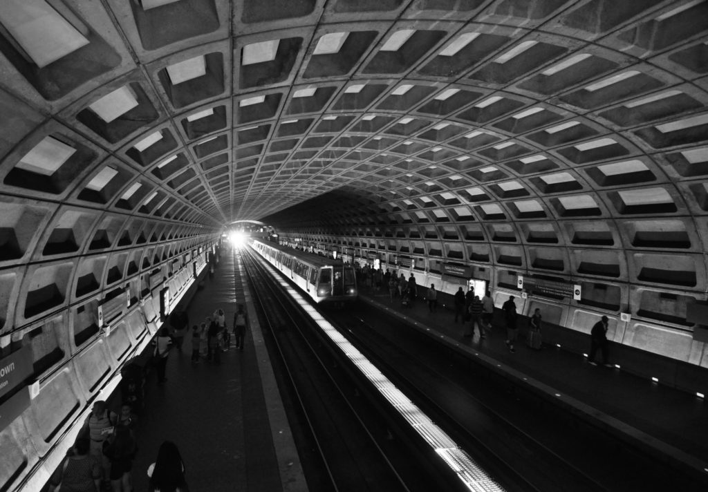
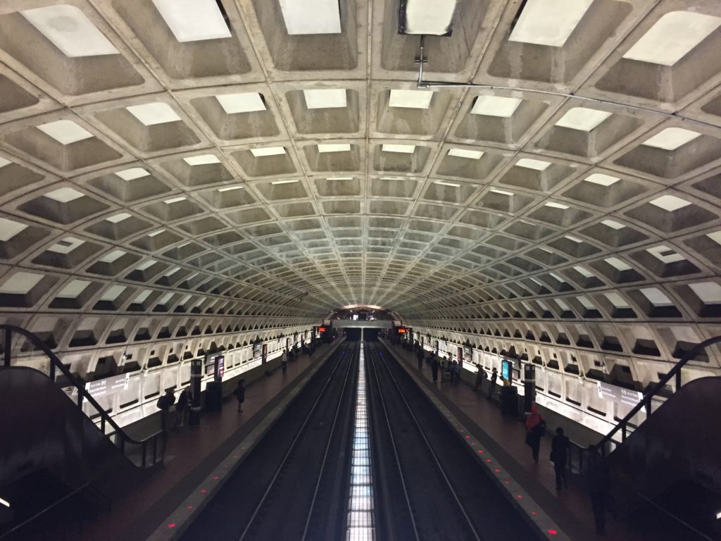
Beyond the Hirshhorn, there are plenty of other buildings to love, but I’m especially keen on the architecture of D.C. Metro, which was designed by Harry Weese and opened in 1976. The deeply coffered, column-free vaults evoke the monumental scale of Washington (each station is 600 feet long) while also serving up dramatic—and photogenic—shadows, thanks to lighting designer William Lam.

Read the full article at On Tap Magazine

Brew-talism from Bluejacket

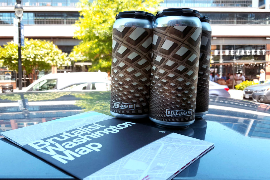
Bluejacket released a new beer, Turnstiles, bedecked with Metro’s coffered vaults.

Local brewer Bluejacket has released a new beer, Turnstiles, that celebrates the DC Metro with a can wrapper depicting the coffered vaults of the system’s underground stations. Scaling down the idea of Metro wallpaper to a more portable and potable package makes sense for Bluejacket, which began weekly unveilings of smaller production runs in cans in February.

Designed in-house by creative director Kris Mullins, the Turnstiles can is part of a limited release program from the brewery that allows greater control on beer freshness. The Bluejacket brewery is housed within repurposed boilermaker shops, which were originally part of the Navy Yards manufacturing facilities; the brewery takes its name from the term for someone enlisted in the Navy.

Tasting notes from Bluejacket:

TURNSTILES is an IPA with Amarillo, Centennial & Citra – 7.0% abv. Double dry-hopped with Amarillo, Centennial & Citra, Turnstiles is teeming with citrus aromatics, accompanied by floral & herbal notes. Juicy & softly bitter on the palate.
$15 x 4-pack.

If your daily ride on Metro makes you feel like you’re hurtling through concrete tunnels in a tin can, now you can upend that metaphor by raising a can that celebrates concrete tunnels. Pairs well with our Brutalist Washington Map, which also features all of the Metro stations.

Bring Your Commute Home with Metro Vault Wallpaper

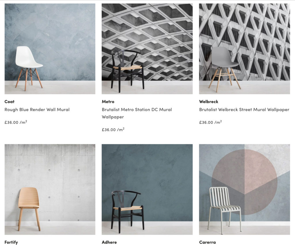
Brutalist Metro Station DC Mural Wallpaper from MuralsWallpaper
via MuralsWallpaper

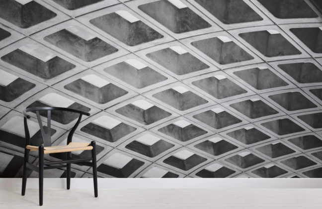
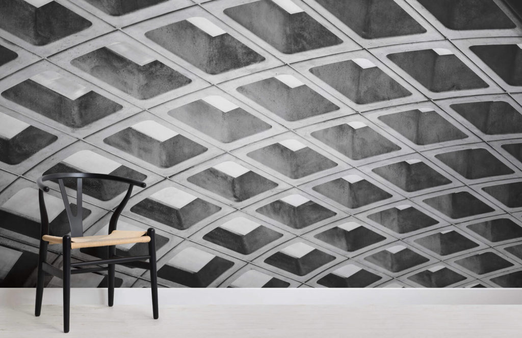
The grandeur of Washington’s vaulted concrete Metro stations elevates the time spent within them. Sure, there will always be people who complain about light levels and cheer for whitewashed vaults, but for those who appreciate the monumental scale of the 600-foot-long stations and their coffered allusions to architecture of the Pantheon and of Daniel Burnham’s Union Station, there’s now a way to bring that experience home: MuralsWallpaper, out of Liverpool in the U.K., has released a design called “Brutalist Metro Station DC Mural Wallpaper.”

If it’s not obvious from the name, this wallpaper design features the coffered vaults of an unidentified—yet pleasantly familiar—D.C. Metro station. MuralsWallpaper offers other Brutalist and concrete choices as well, including one that features London’s threatened Welbeck Street car park, but this D.C.-centric one rings our BrutalistDC bells for obvious reasons. At £36.00/m(no word yet on whether any proceeds would benefit WMATA), it’s a much better deal than actually vaulting your ceilings and waiting for the concrete to cure. And it’s certainly a more aesthetically pleasing solution than painting your walls white.

Concrete options from MuralsWallpaper

via MuralsWallpaper | H/T to Dezeen

Curbed Architecture Critic Alexandra Lange ‘Eavesdrops’ on Metro Design Icons

© Deane Madsen | Gallery Place–Chinatown Metro

In a recent post on Curbed, architecture critic Alexandra Lange dove into the history of the Washington, D.C. Metro (a.k.a. WMATA), finding that its designers envisioned a forward-looking transit system with longstanding appeal. Metro architect Harry Weese and his firm traveled the world studying existing transportation examples, noting details down to the fabric selection of ticket collectors’ uniforms, before returning stateside to design what has become one of D.C.’s most recognizable landmarks. The D.C. Metro system has been celebrated since its 1976 opening for its column-free, Brutalist vaults of concrete, and was the recipient of the AIA 25-Year Award for Architecture in 2014. This spring, D.C. Metro became the focus of controversy discussed elsewhere and on these pages for (in addition to longstanding issues of management, safety, and scheduling) an ill-advised whitewashing of the vaults at its Union Station stop.

One resource Lange studied was a self-published book with a cumbersome title–”For the Glory of Washington: A Chronicle of Events Leading to the Creation of the System-Wide Architectural Concept for the Design of the Washington Metro Stations, December 1965 – November 1967″–by Stanley Allen, who was chairman of Harry Weese Associates at the time. This book chronicles the firm’s deep involvement in the systemwide design of the D.C. Metro system. Lange sifts through accounts of a worldwide subway tour to preliminary sketches to CFA hearings, and links her findings to current stances on infrastructural maintenance across the country:

To honor the people who clean, upgrade, and augment, we have to see transit design as Weese did: distributed across the city, both as a network of connected stations, platforms, and trains, and as a network of connected tasks. Weese and his team identified the problem, but needed the sometimes harsh design critiques of the Commission of Fine Arts (CFA), “the only federal commission dedicated to design review and aesthetic excellence,” as it says on its website, to create a solution that spoke to place, operations and maintenance.

Maintenance has long plagued the D.C. Metro system. In response to outcry from the architectural community and preservationists over the Union Station paint job, some Metro riders voiced approval for the painting, citing the need for brighter conditions. But underground white paint can only reflect the light that shines on it, besides which, it is a temporary solution–a $100,000 bandage that will need to be re-applied continuously–when upgrades to William Lam’s lighting design, if budget allowed them, would provide a more permanent fix. Again, Lange:

If WMATA had consulted with the CFA or historians, they might have learned that the concrete, if cleaned, with the lighting maintained as Lam intended, would solve the very brightness problems the paint (three coats, easily soiled) provided a short-term solution for. … The paint offers a momentary ‘Ah!’ but the money would be better spent on soap and replacing the lightbulbs with new LEDs—work less likely to be noticed because it’s maintenance.

The purists among supporters of Brutalism note that the style’s moniker stems from béton brut–or, raw concrete–meaning that the paint not only issues a long-term repainting sentence that WMATA seems incapable of serving, but also detracts from the architectural and stylistic integrity of the D.C. Metro.

Former Washington Post architecture critic Benjamin Forgey raised a similar outcry in 1992 over the repainting of the Farragut North Metro station, comparing the D.C. Metro’s 600-foot-long, public great halls to classical architecture:

Like much of the city’s above-ground architecture–the barrel vaults in, say, John Russel Pope’s National Gallery West Building or Daniel Burnham’s Union Station–it is based upon classical precedents. But in its forthright expression of structure in those bold concrete vaults, it’s also modern–a shadowy, richly textured space of our own time. There’s no mistaking that the color and texture of the concrete contribute greatly to the architectural effect.

Perhaps Forgey gets to the point quicker: Paint applied to the vaults flattens out the texture for which the D.C. Metro stations and other Brutalist buildings are celebrated, and you don’t solve problems (of lighting, concrete deterioration, or any others) by painting over them.

Today on WAMU’s Kojo Nnamdi Show: Whitewashing Metro?

This afternoon, WAMU dives into the questionable painting of the Union Station Metro station in Washington, D.C., which was recently coated in a layer of white paint. Local architecture reporter Amanda Kolson Hurley, the recipient of this year’s Sarah Booth Conroy Prize for Architectural Journalism, and Matt Johnson, editor of Greater Greater Washington, will discuss the issue on air today.

Listen here:
http://thekojonnamdishow.org/shows/2017-04-03/should-metros-walls-get-a-paint-job